web design

StackUp

Visual Identity
Category
Technology Product
My Scope of work
Visual Identity Development
Web Design
year
2024
Read more
Read less

Brand overview

StackUp as a platform that provides an end-to-end developer experience, providing developers globally with opportunities to Learn, Earn, Build and Connect.
StackUp apps work in tandem with one another, creating a synergistic ecosystem for developers and organisations.

Target Audience

  • Developers of all levels
  • Tech Organisations

Marketing Positioning

  • A global platform with users from different parts of the world
  • The go-to platform for developers (we want all developers to create a StackUp account, like how they are creating a GitHub account)
  • All-in-one ecosystem of products
  • Pool of diverse developer communities
  • Wide variety of apps and opportunities

Brand Core Visual Identity

Logo

Color palette

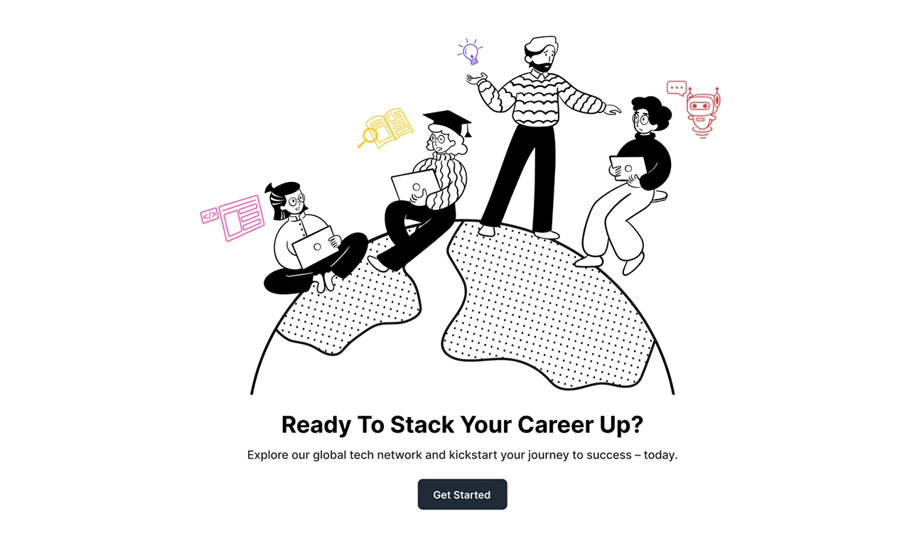
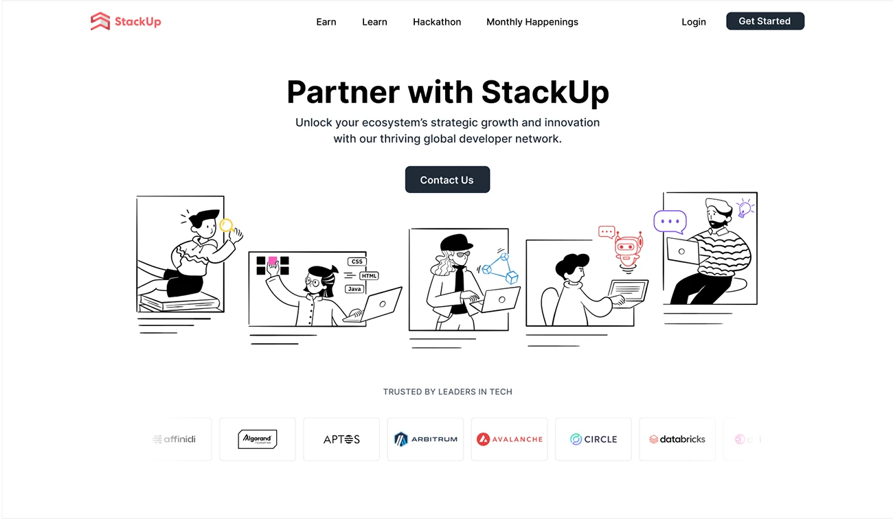
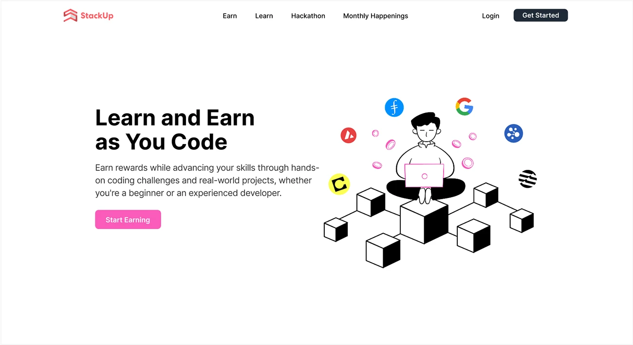
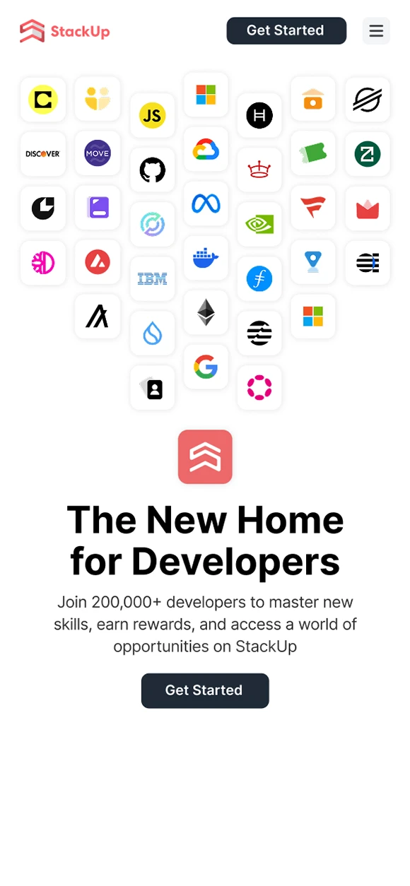
Dominated by primarily neutral colour palette (black, white, grey)
Integrate vibrant pops of colour to highlight important elements and calls to action.

Typography

Iconography

The icon system includes 3 styles:
Color, Solid, Outline.

Color style is used for logos of apps in StackUp ecosystem

Graphic and Layout Principle

Clean and uncluttered layout with sufficient white space for better readability.

Illustration

Illustration Principle

  • 2D Monochrome illustrations with colour accents to present different apps.
  • Clean stroke.
  • Mix between black outline and black solid fill.

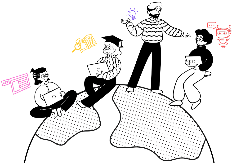
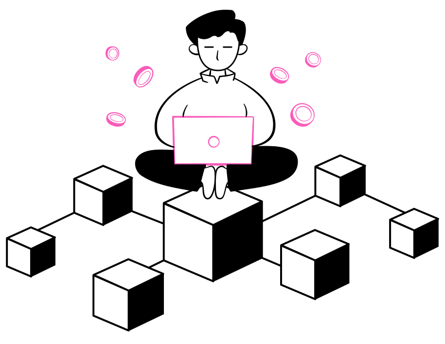
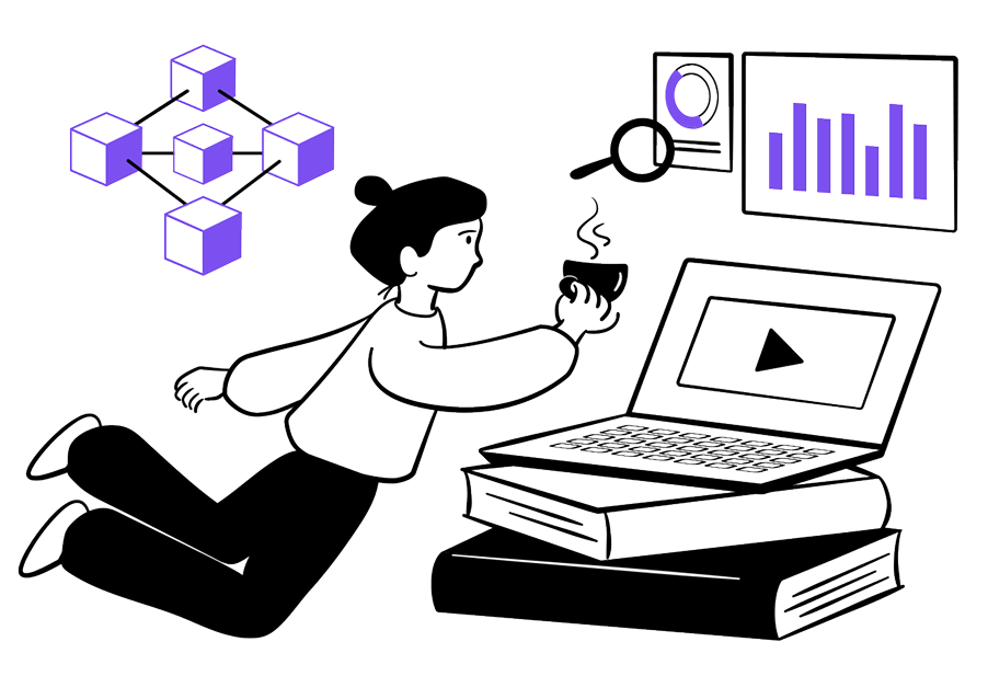
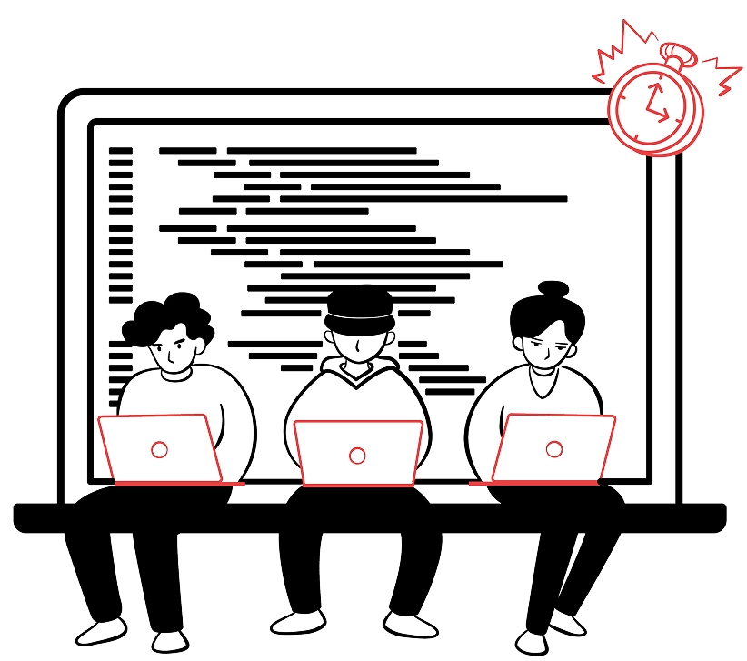
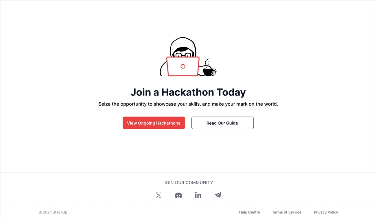
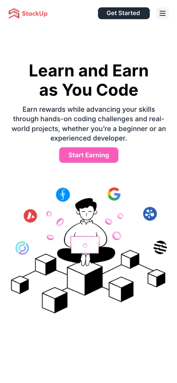
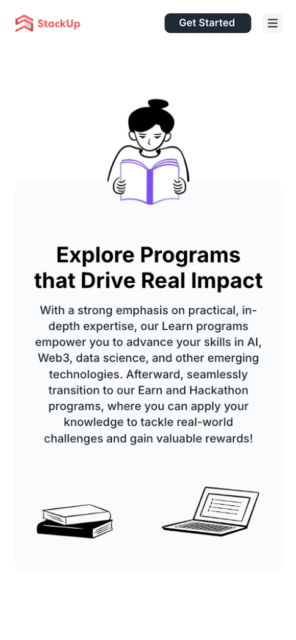
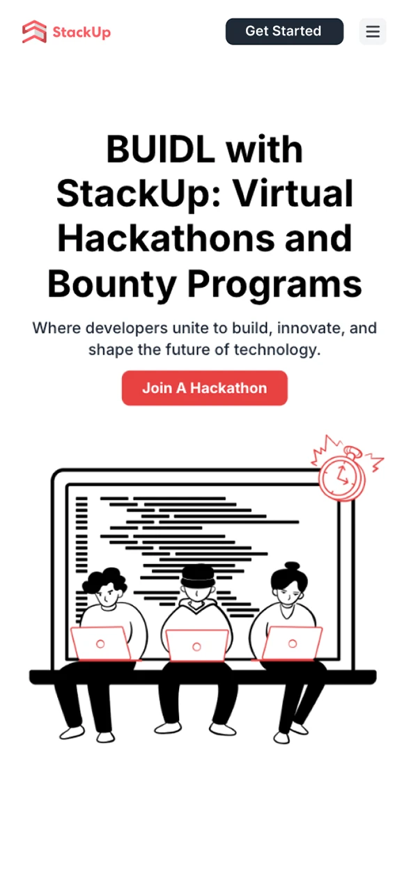
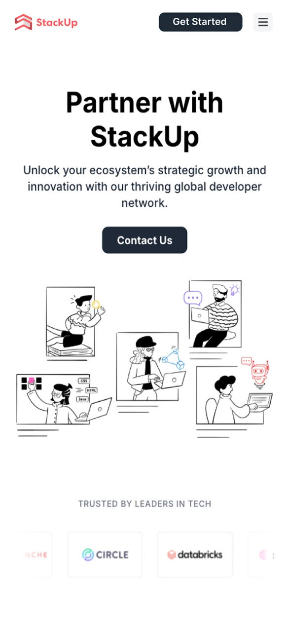
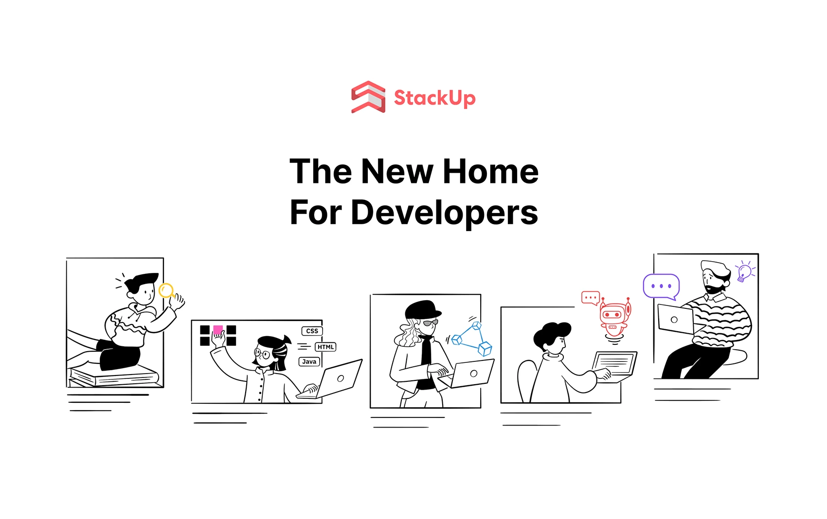
Using illustration as part of the core brand identity helps the brand stand out from its competitors in the technology sector. Illustration also creates a sense of intimacy and humanity, helping to bridge the gap between the platform and the user.

Characters

Objects

Characters with scene

Website Application