Challenge
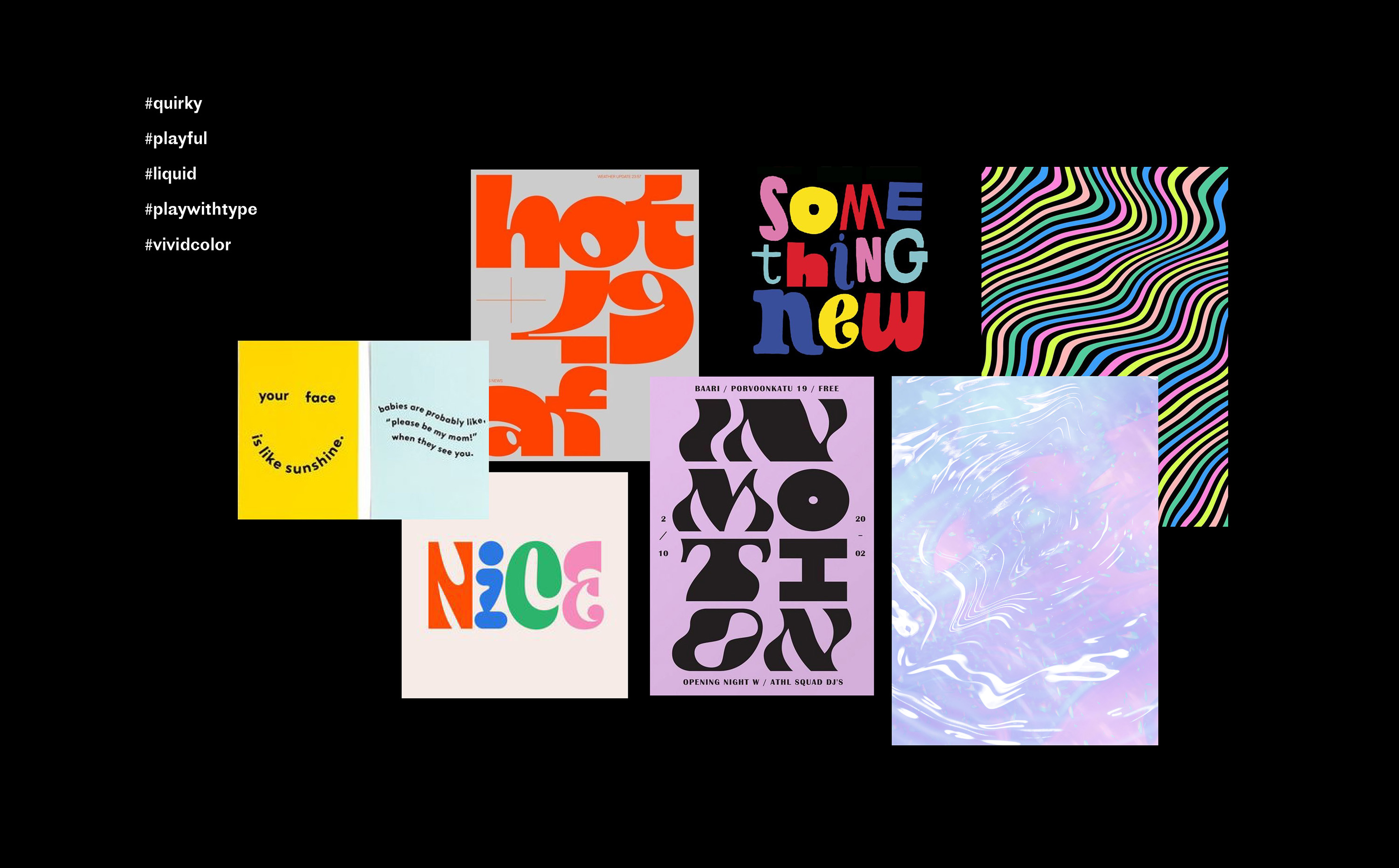
The visual identity for Otuplus aims to highlight its uniqueness and creativity, setting it apart from competitors while capturing its youthful, mischievous, and quirky essence
Approach
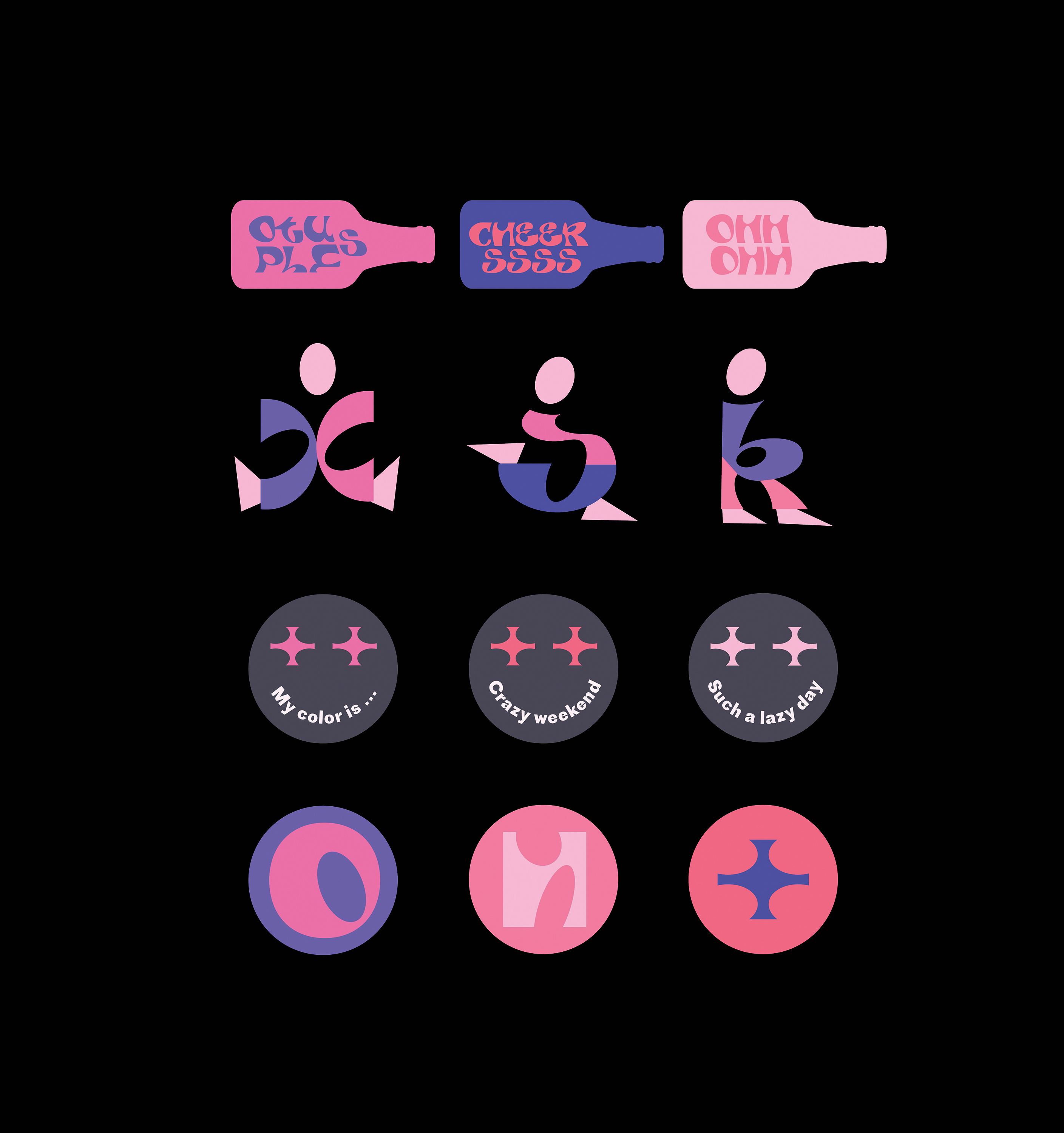
The design concept draws from their product's unique flavor mixing process, emphasizing a creative, bold, and mischievous spirit through a "Mix n Match" and "Unexpected Things" theme.
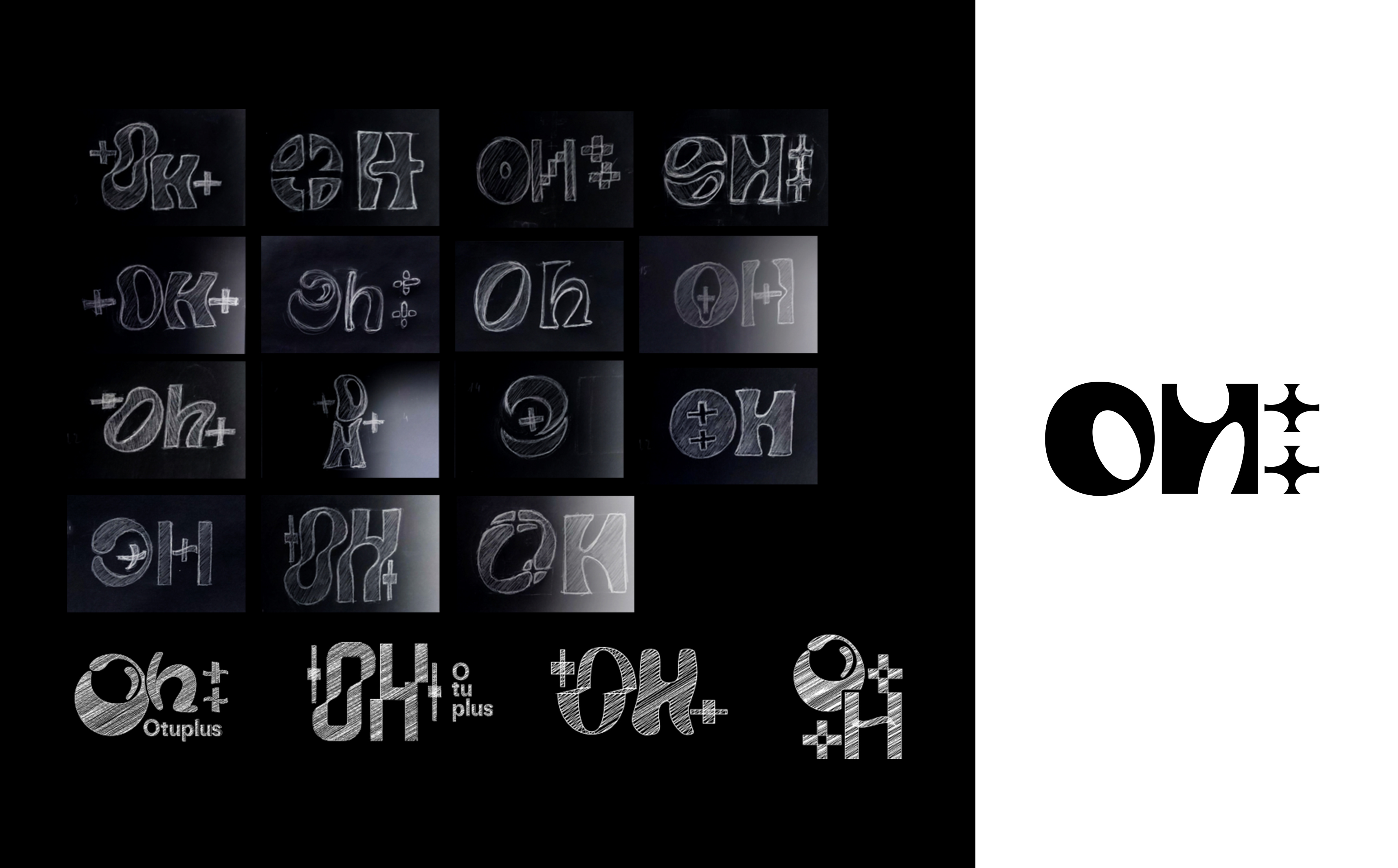
The logo's ellipse shape in the letter forms represents the "Oh" sound, linking verbally to the brand name. The plus (+) graphic mirrors this shape, reinforcing the connection.
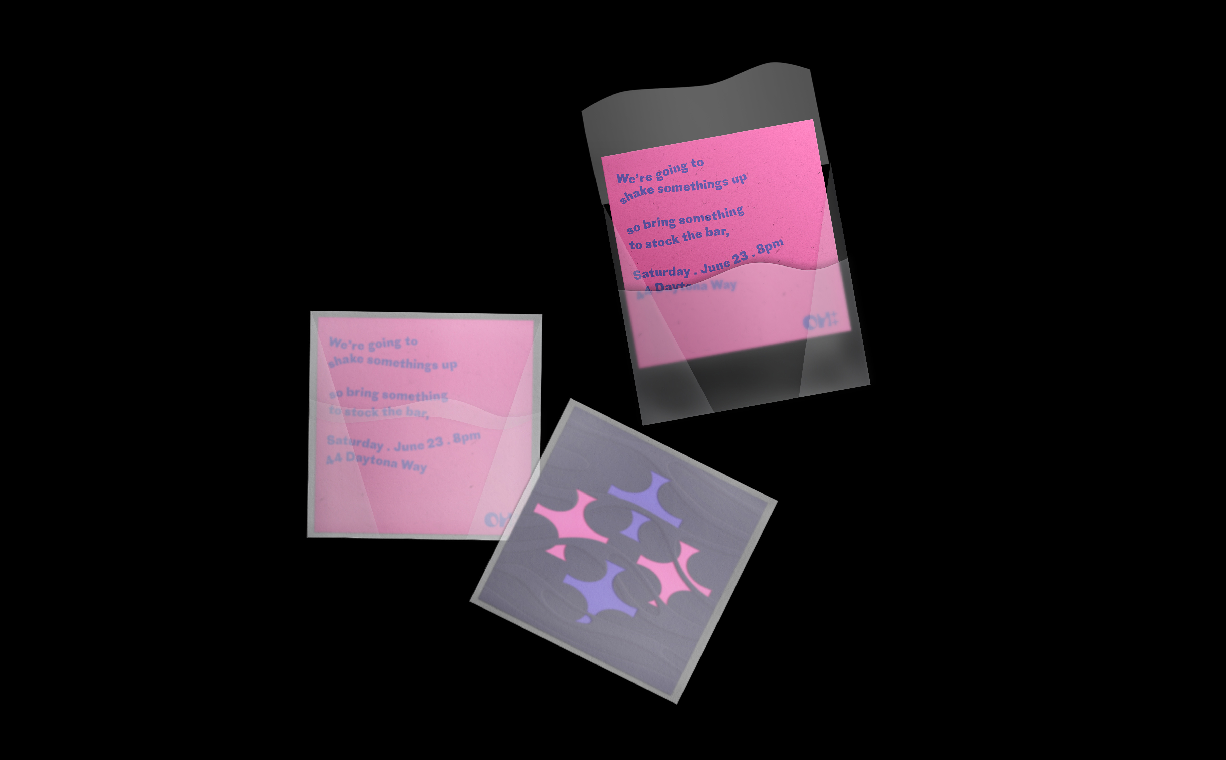
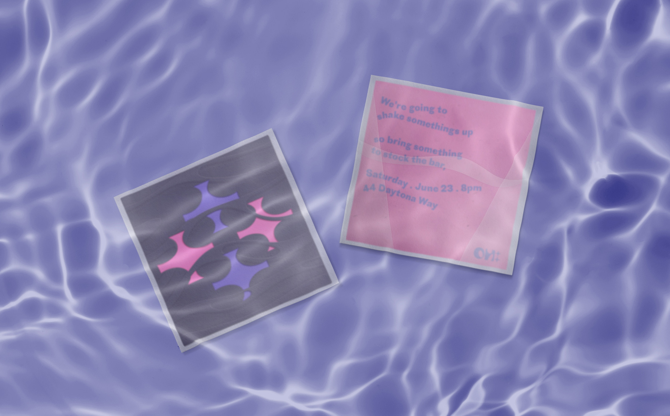
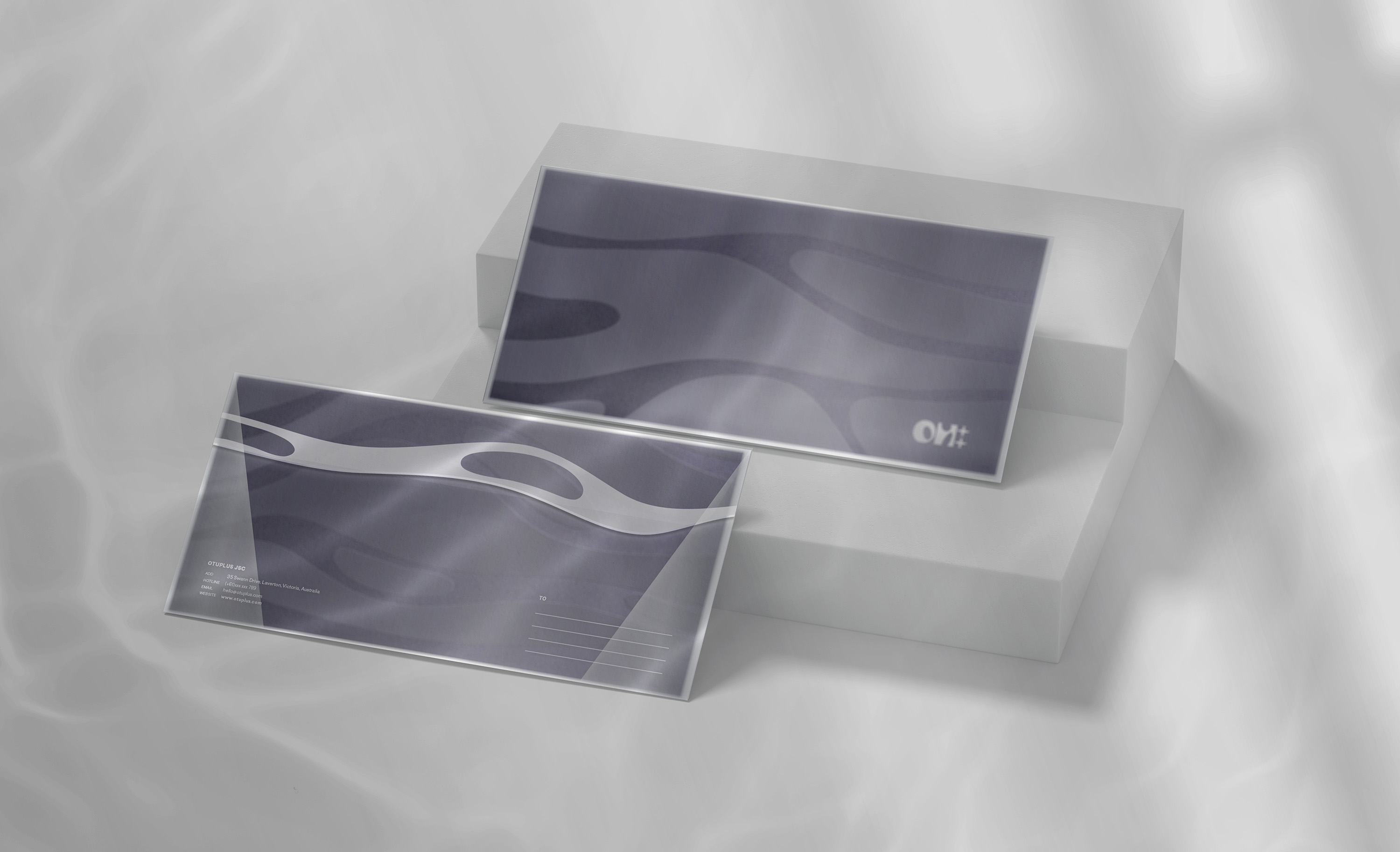
Plus (+) graphics represent the MIX, integrated with a liquid pattern symbolizing MATCH. Some lines of text are treated to take on liquid forms.
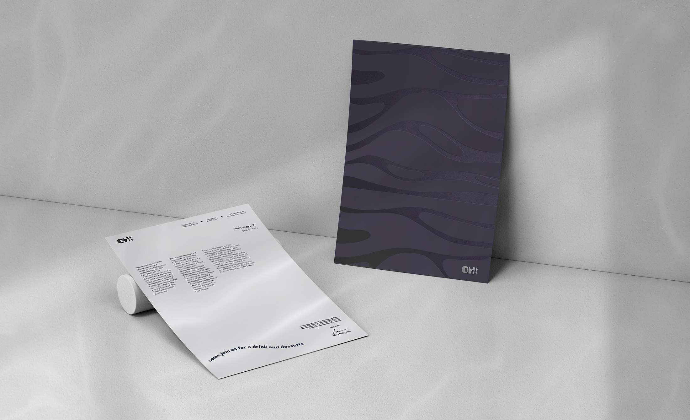
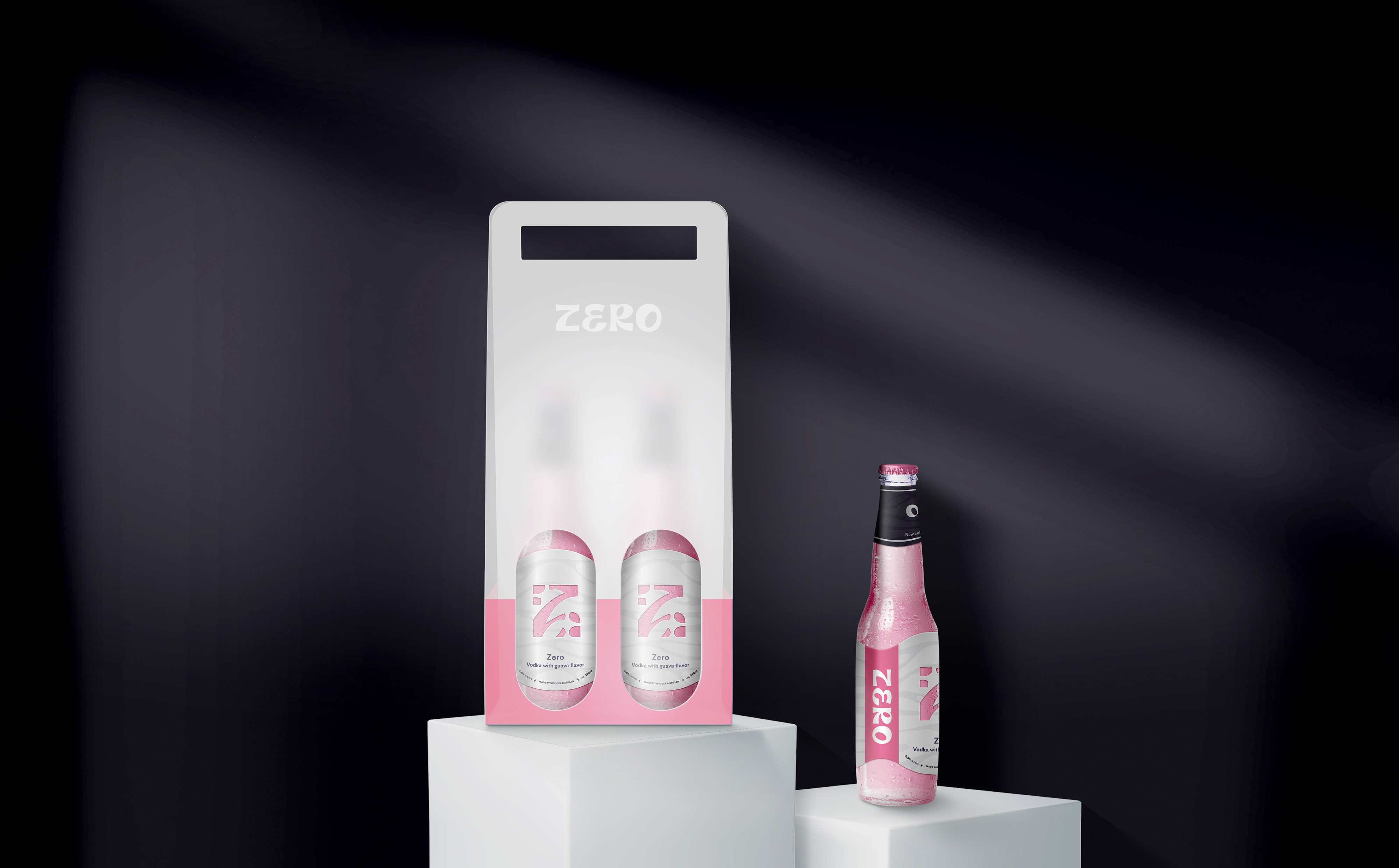
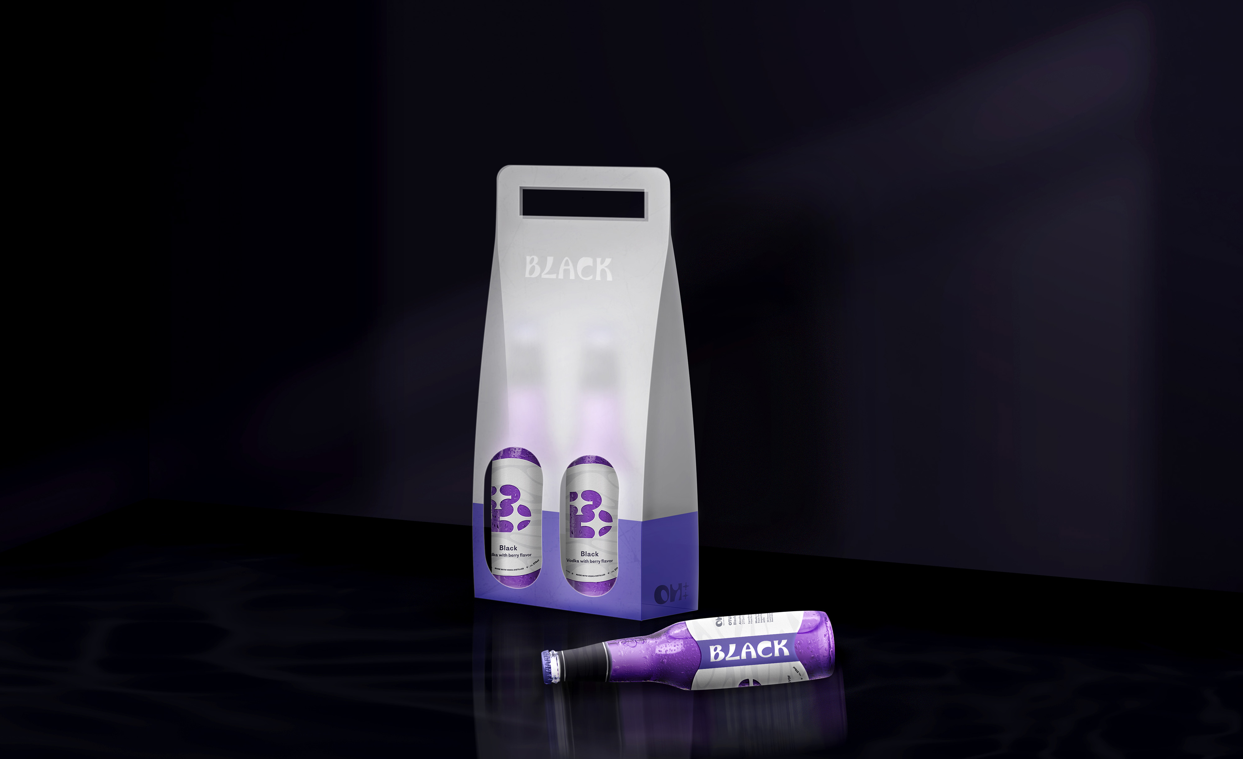
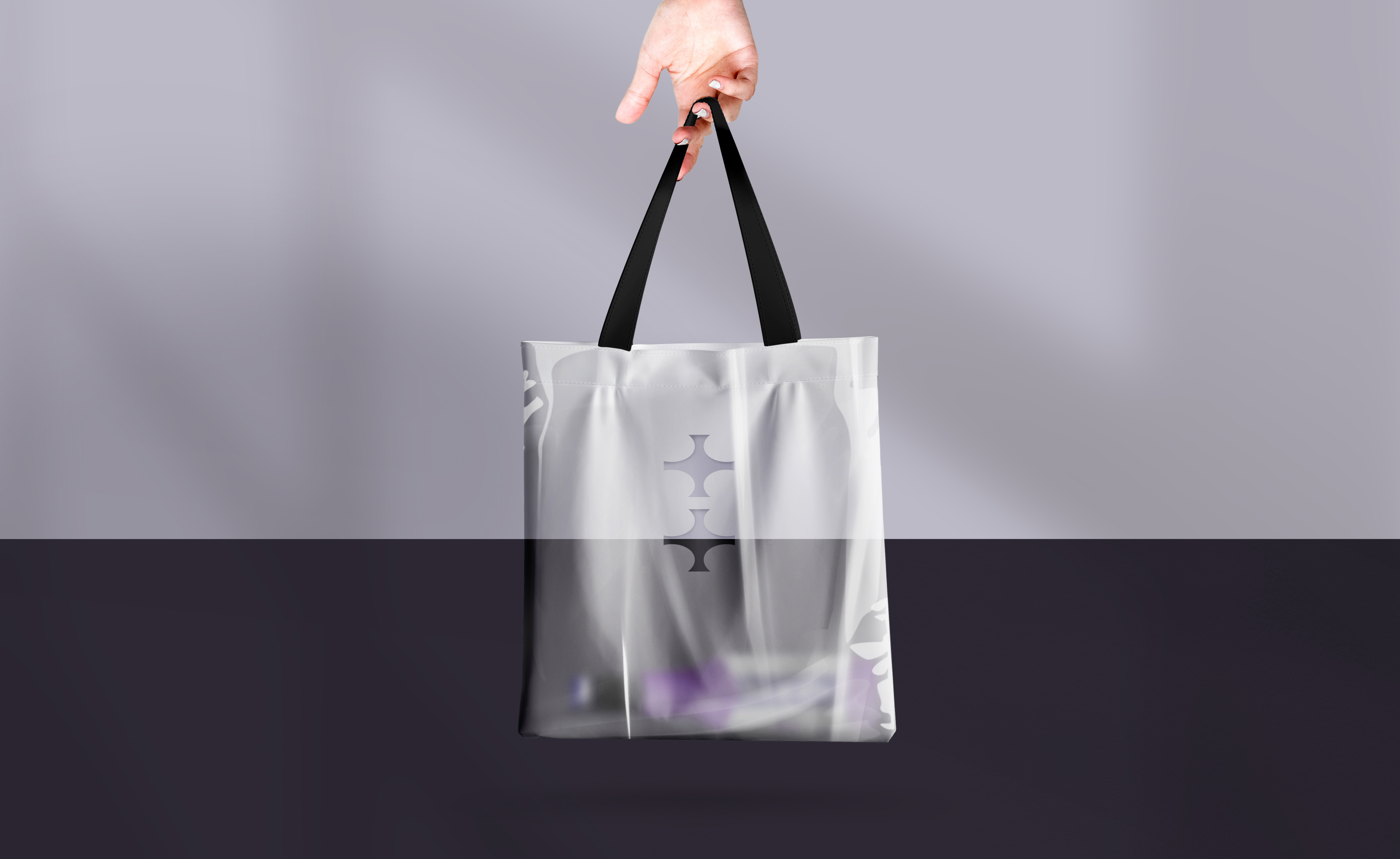
Translucent materials in products like envelopes, bottle carriers, and shopping bags partially reveal the design inside, creating intimacy and mimicking the ambiance of dimly lit party settings.
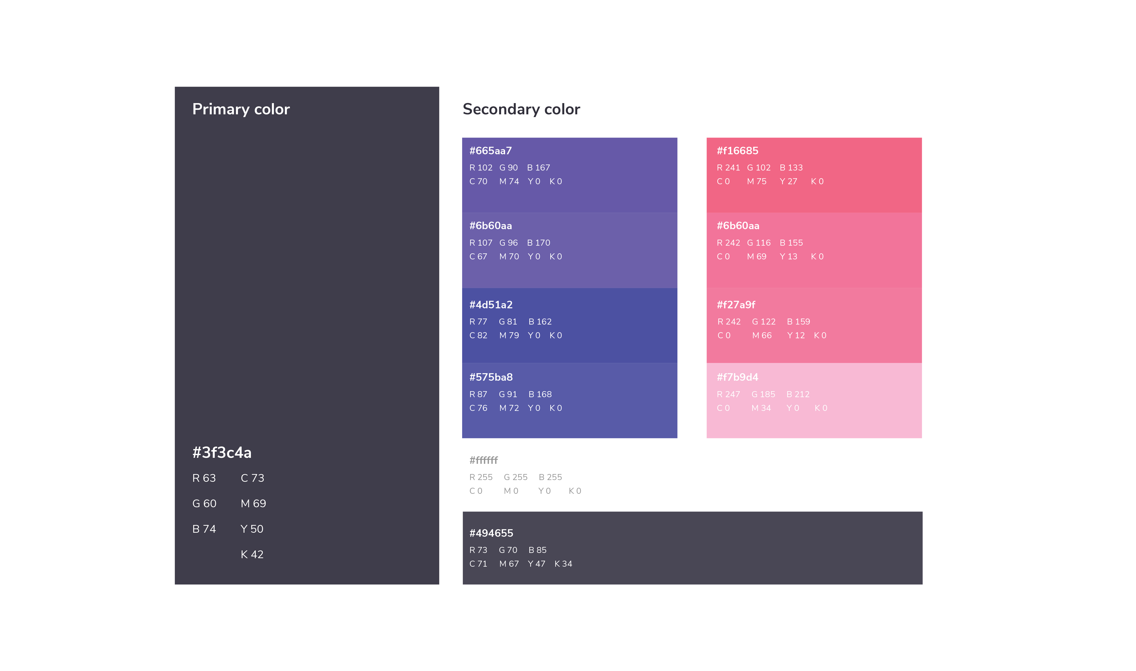
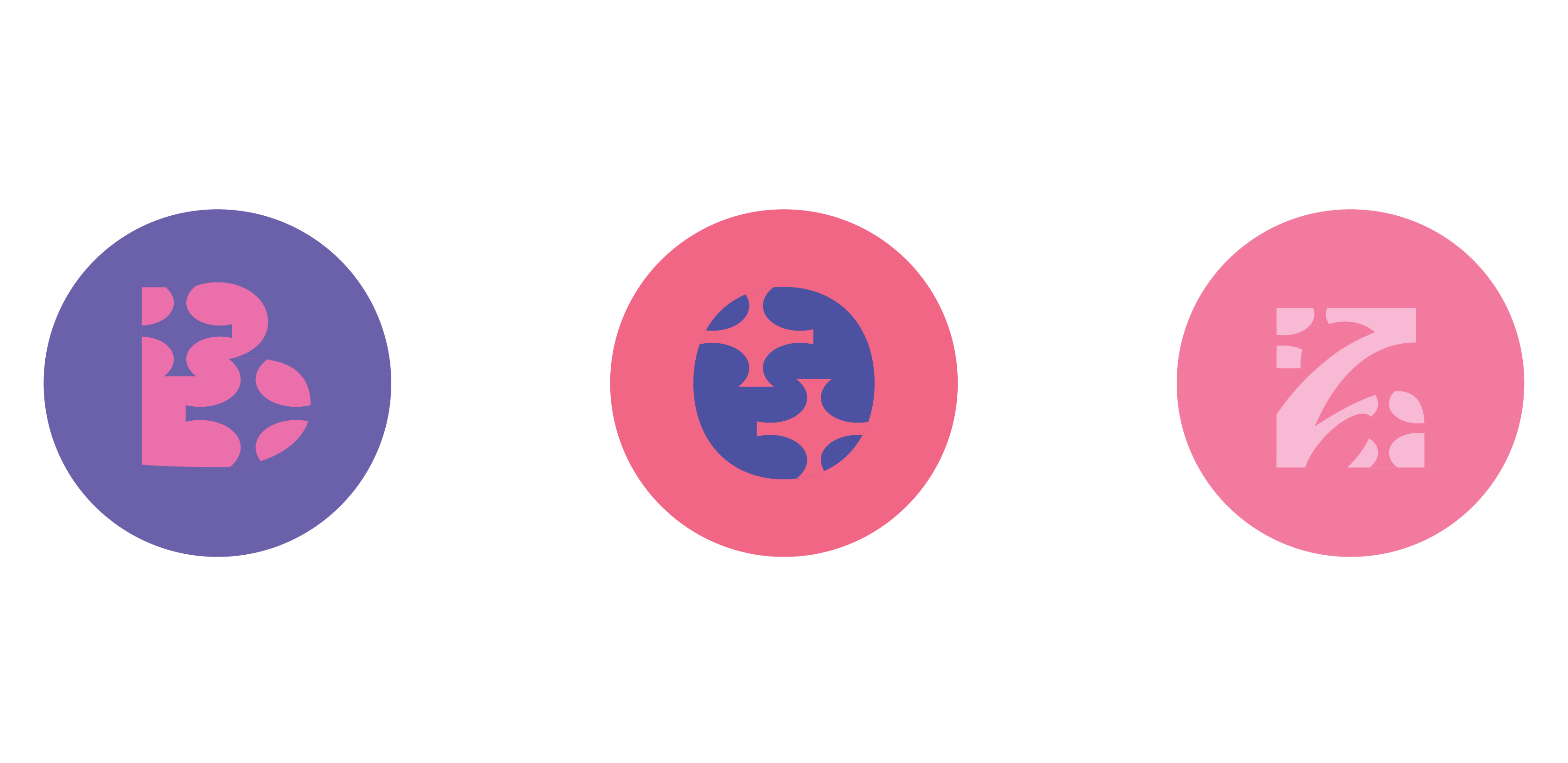
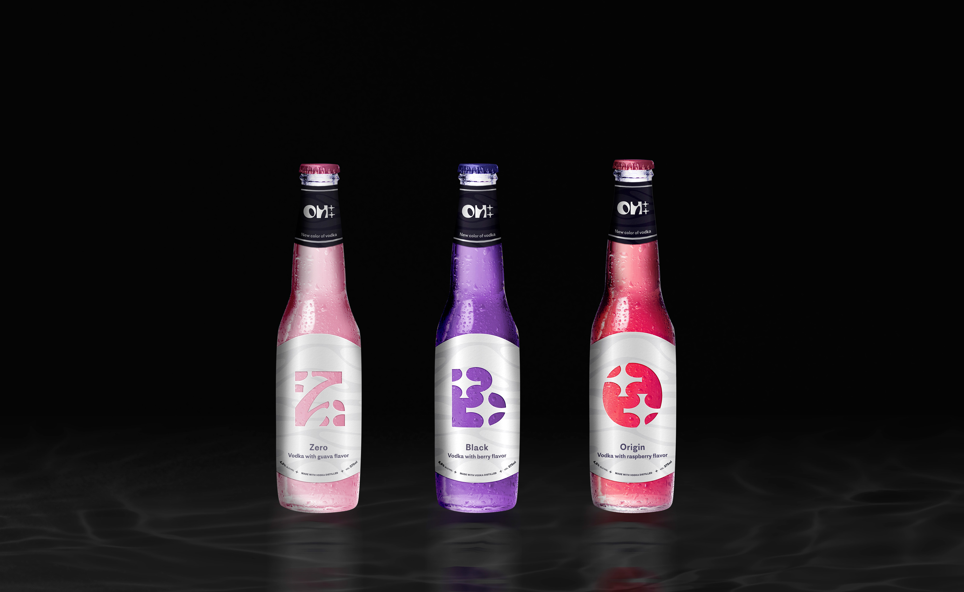
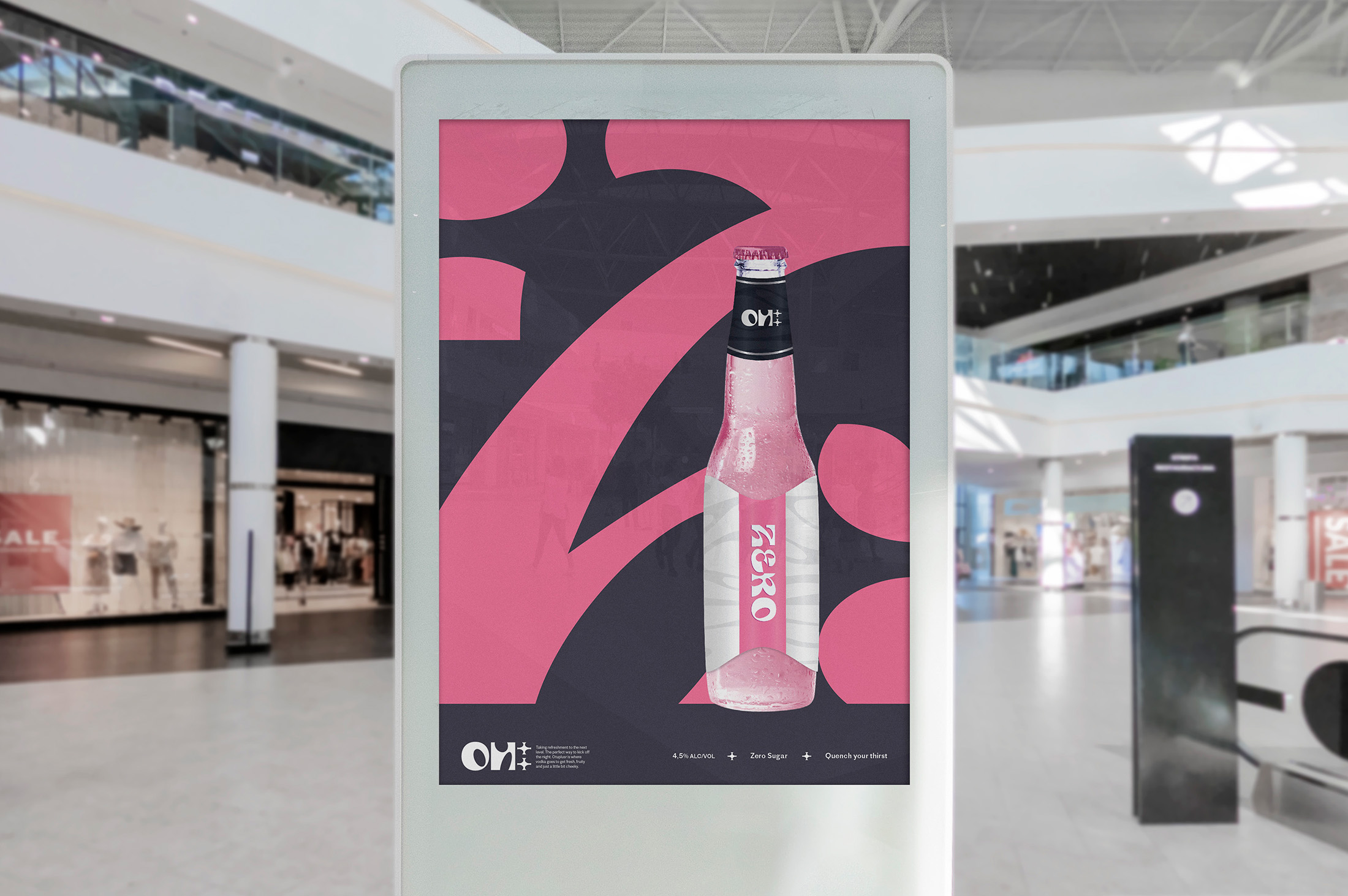
Set of 3 main flavors:
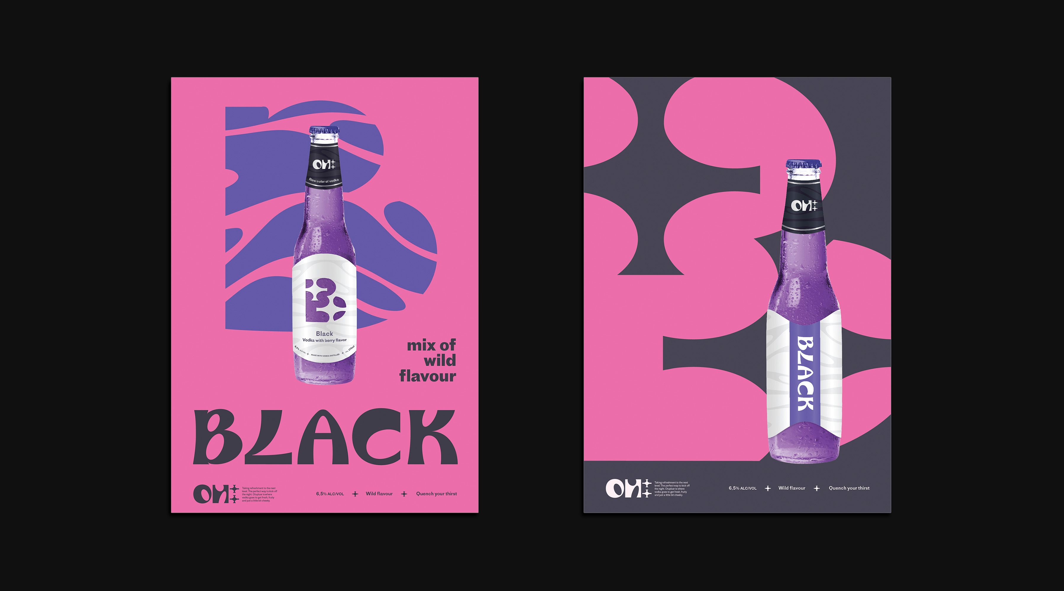
Black, Origin, Zero
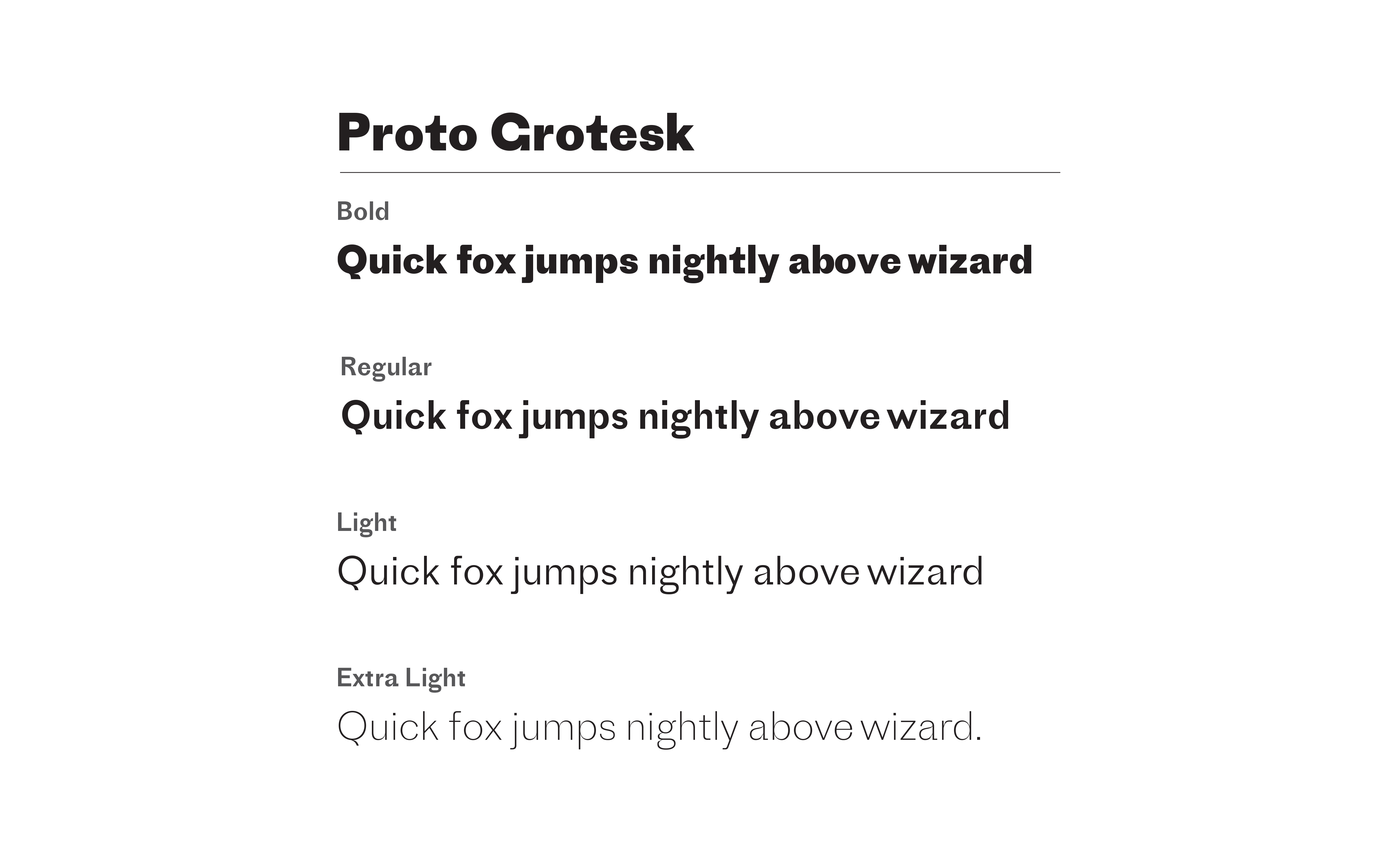
Custom types for each flavor's name
The custom types are developed using the same design pattern as the logo shape.